

CHEESESTEAK MATCHBOOKS
The City of Brotherly Love is renowned for its cheesesteaks that have earned a following far and wide. This project aims to revamp three of my all-time favorite cheesesteak joints, capturing the essence of each culinary legend and creating a new sleek, modern design. In addition, creating a series of contemporary matchbooks gives these shops the branding they need to serve up a complete sensory experience.
Instructor - Kelly Thorne
Fall 2022
INTRODUCTION
As a proud Philadelphian, "Cheesesteaks" was one of my first thoughts when Kelly Thorne presented the Matchbook project to our illustration class. Creating a series of three matchbooks for three locations is a fun prompt and very open-ended prompt. Matchbooks are a staple in branding for fine dining, mechanics, and dive bars. To add to this legacy, I wanted to choose something I am passionate about and with room for improvement. My favorite cheesesteak spots around the city all sport a vintage look, fitting for the traditional stores but lacking consistent branding and unique identity. I think redesigning these Philly landmarks would send people into a frenzy, so this project was a great time to make an example of what they could look like if they rebranded instead of actually doing so. My goal was to rebrand three of my favorite cheesesteak shops to have a more considered identity and personality through only the example of a matchbook.


RESEARCH
I started by selecting my three candidates for a new matchbook. Dalissandro’s is my favorite cheesesteak, but the overall vibe is intense. Rocco’s is probably the most underrated steak, a genuine motivation to visit the Home Depot it is next to. Ishkabibble’s has a long name and currently has funny pink branding. Each location has its own unique atmosphere and could boost visuals.
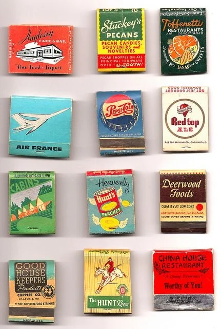
Next, I looked at a bunch of matchbooks for inspiration. Matchbooks really are such lovely designed objects. I love the vintage look of matches people have collected over a long time, and that vintage or traditional feel could be applied to my own. I also discovered the variety of matchbooks that exist. Classic square matchbooks, long matchbooks with long matches, matchboxes, and big match matchbooks with illustrations on the match. I guess matchbooks are like the cool cousin of the business card. With my research of types of matchbooks and general style ideas, I moved forward.
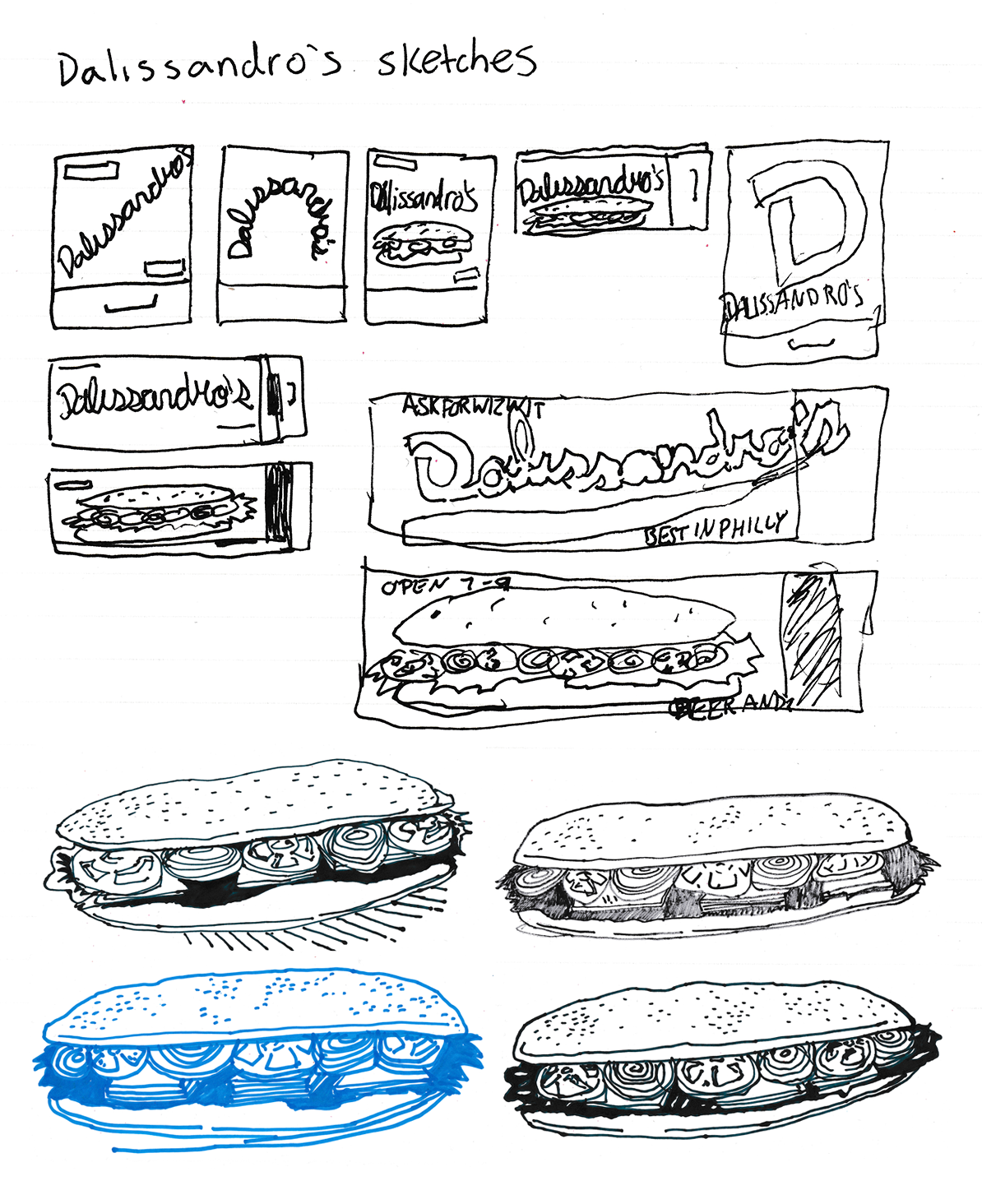
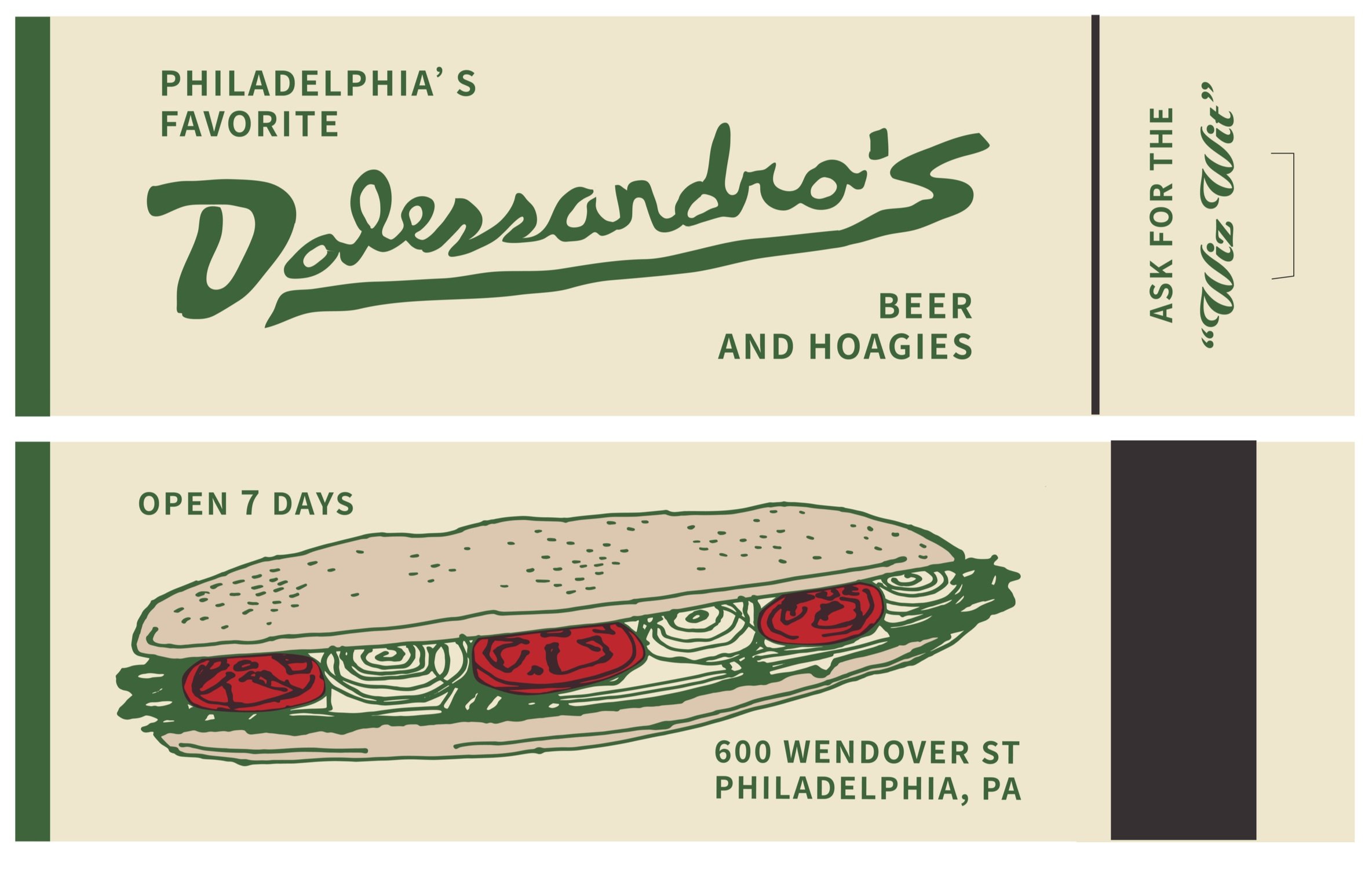
I decided that Dalissandro’s should have a long vectorized cursive signature that reflects its age and longevity. To fit the type, the matchbook is made extra long and is mimicked by an extra-long sandwich on the flip side. One of my earliest cheesesteak memories is going to Dalissandros on a Saturday and eating the same sandwich until Monday. The steak is still quite large, making the illustration more genuine. When illustrating the sandwich, I drew several variations with markers on paper and scanned them onto my computer. When coloring the sandwich, I only used red and tan. I added the colors as transparent layers to mimic vintage printing techniques. The green from the sandwich is applied throughout to show quality and taste.

Rocco’s is an authentic South Philly cheesesteak. The best reason for going to Home Depot is knowing that a warm Italian sausage or cheesesteak is right next store. I decided to give Rocco’s an orange checkered paper sandwich wrap to make it feel more friendly and a bit humorous. This wrap extends around the sides of the matchbook to make the wrap obvious and fake. The orange is Rocco’s ode to Home Depot without saying anything else. To seal the wrapper, a Rocco’s sticker is put right in the center in a bold fun typeface. To add some more information, the backside is a solid blue to reflect the blue-collar atmosphere at this store. Menu items are added in a fun random order.


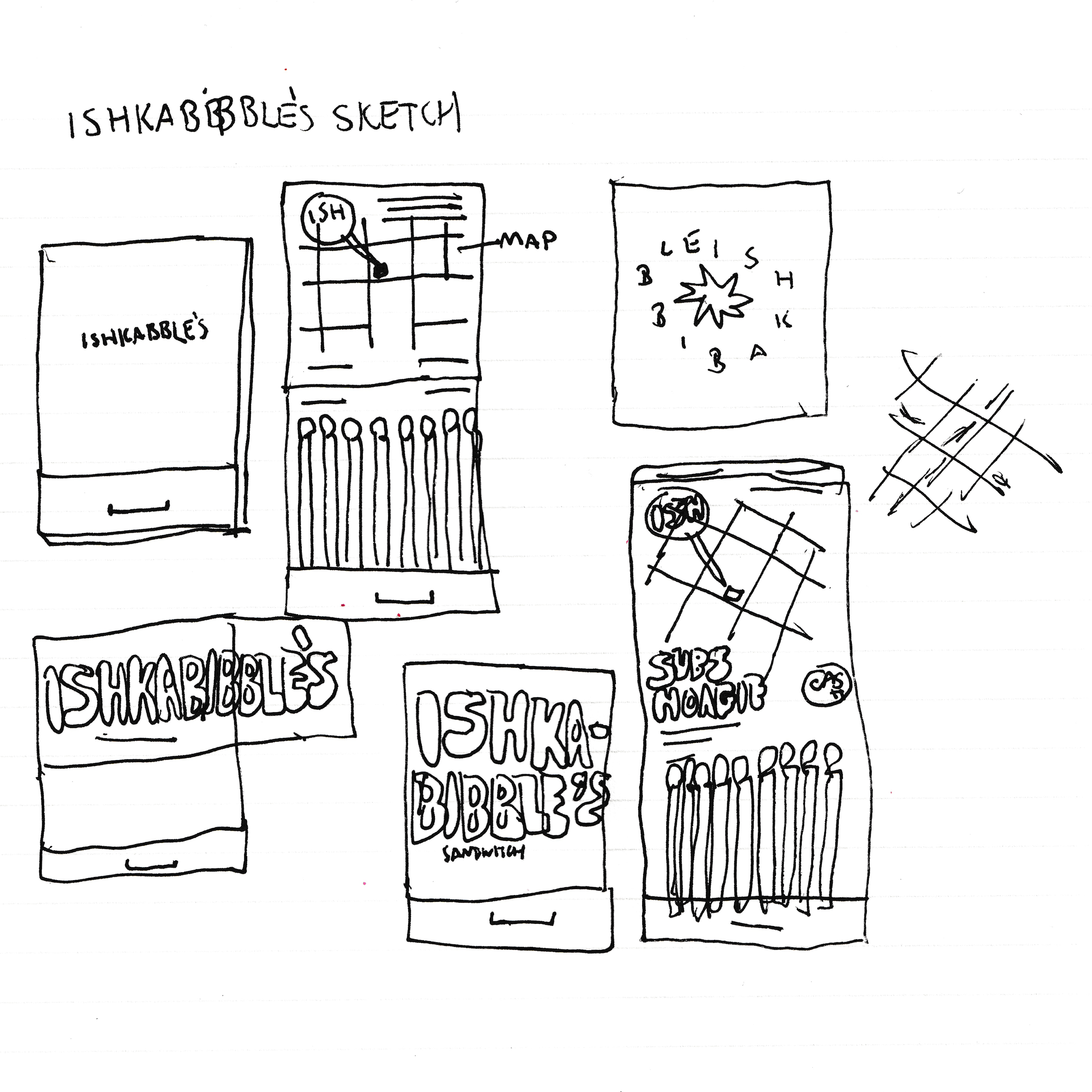
My favorite thing about Ishkabibble is its name. I think that they agree too. I wanted to give the Ishkabibble’s type a bold look but struggled to contain it on a small matchbook. I decided to hyphenate. The majority of the steak shops across the city feature a simple naming formula of Somebody’s leaving some apostrophe fun on the table. I chose a round bold sanserif font that encapsulates the playful yet bold look of this redesign. I aligned the hyphens and the apostrophes to give them a purpose and boom, the Ishkabibble’s matchbook cover is finished. On the inside, a map, a menu, and a cash-only reminder tell you everything you need to know.


SUMMARY
While the cheesesteaks at each location do enough to keep bringing people back, these matchbooks and rebrands add a bit of complimentary flair that helps to enhance the overall experience. It is challenging to rebrand iconic establishments without jeopardizing their tradition and history. I approached each matchbook with that in mind. I searched for solutions that add flair without overstepping, changing the audience, or selling out. Matchbooks only give you a glimpse into the company's branding. Still, I can see how these matchbooks could form a complete identity. I enjoyed this project and all the challenges presented along the way. I am proud of how it turned out.